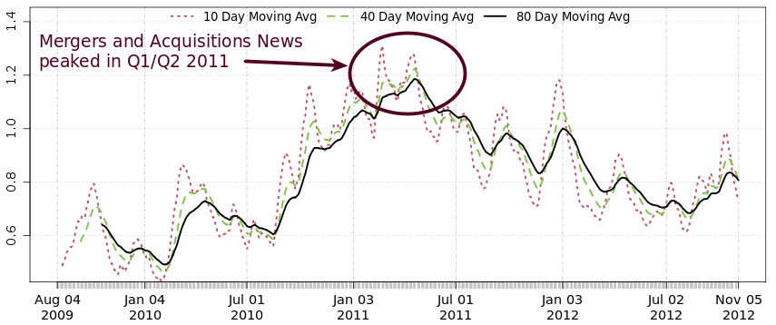
The graph below represents M&A news chatter activity through time, with the Y-axis representing M&A news as a percentage of the overall news flow. The graph shows that M&A news peaked in Q1/Q2 2011 (at around 1.3%) and has been declining ever since.
(percent of overall news flow)

 RSS Feed