• Home
  • Tutorials
    • Intro to Margin Accounts
    • Portfolio Margin 101
    • How Portfolio Margin Works
  • Resources
    • Option Strategies - Reg T Margin
    • Option Strategies - Portfolio Margin
    • Margin Calculators for Options
    • Regulatory Timeline
    • Stress Test Market Moves
    • P&L Offsets
    • Brokers Offering Portfolio Margin
    • Margin Rate Comparison
  • FAQs
  • About Us
    • Disclaimer
  • Blog
The Margin Investor

Predicting S&P 500 Returns using "Recession" News

11/10/2012

1 Comment

 
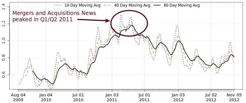
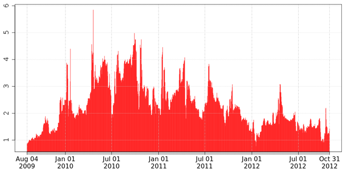
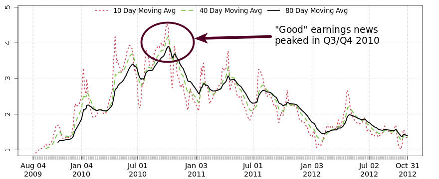
The last two blog posts focused on quantifying news stories to shed light on Earnings news and M&A news. Today, we'll carry on with this theme to look at "Recession" news. Again, the idea here is to collect news articles on S&P 500 stocks and then compute the percentage of that overall news flow that has to do with "recessions".  

The charts below plot recession news (see top chart) and the SPY ETF (i.e. S&P 500 ETF) on the lower chart. 
News articles for S&P 500 stocks: Recession News
(percent of overall news flow)
vs.
SPY (S&P 500 ETF)
Recession News
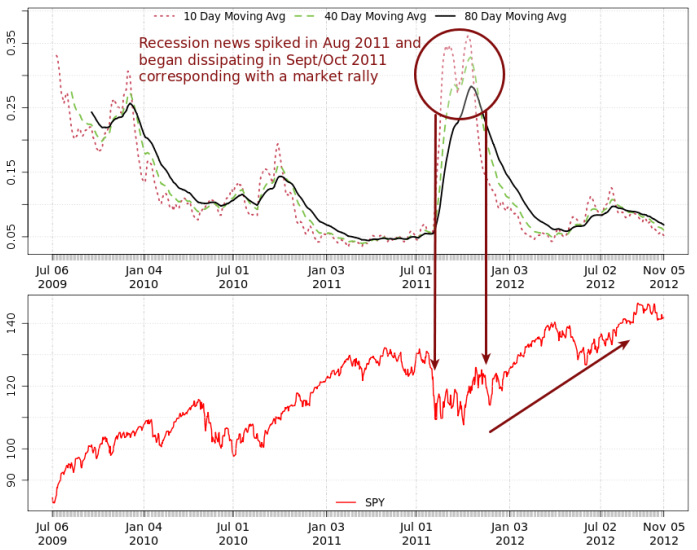
The most salient point we can deduce from these graphs is that recession news spiked in Aug 2011 to around 0.35% of the overall news flow. This massive spike corresponded to the sharp market sell-off. Then, as recession fears mitigated, recession news flow dissipated, and the market began it's 2012 rally. 

As investors, we have some obvious questions about this metric: 
  • Does it have predictive value?
  • Does the market follow the news or does the news follow the market? 
I don't have a long enough data history to render a definitive conclusion. What's clear however is that news chatter around "recession" certainly doesn't help the market. 

Looking at the more recent data, it appears that recession news is nearing a post spike low. This seemingly should bode well for the market going forward. 
1 Comment

Mergers and Acquisitions - What's the news saying?

11/9/2012

0 Comments

 
Apropos of my previous blog post discussing quantifying news stories, I present an additional news metric that provides food for thought.

The graph below represents M&A news chatter activity through time, with the Y-axis representing M&A news as a percentage of the overall news flow. The graph shows that M&A news peaked in Q1/Q2 2011 (at around 1.3%) and has been declining ever since.
News articles for S&P 500 stocks: M&A News 
(percent of overall news flow)
Mergers and Acquisitions News
0 Comments

The Quantitative Story of the News 

11/6/2012

3 Comments


What trader doesn't love CNBC, right?

Like many traders I watch CNBC and Bloomberg TV religiously. Keeping abreast of breaking news, market happenings and listening to the talking heads espouse and debate their opinions - what could be better, right? While you may not always agree with the viewpoint being promulgated, understanding the merits of the argument has value in and of itself. 
That said, there was a point in time where my appreciation for this news commentary changed dramatically. I remember quite distinctly the moment: it was the height of the 2009 financial crisis and my portfolio was experiencing extreme volatility. The market was up on that particular day, which was a relief for everyone as we had just experienced several large down days. I tuned to CNBC to see which bank had just staved off bankruptcy. The talking heads had a very reasonable, well thought out explanation for the precipitous market upswing. The explanation evaluated the incoming news information and built a compelling case based on fact and opinion. Satisfied with the explanation, I carried on with my day.  
Picture
Fast forward a few hours later and the market had taken a sharp turn to the negative. Once again, I tuned to CNBC to see what had changed to warrant this new market direction. Lo and behold, the only thing that had changed was their conclusion! The same narrative, the same compelling arguments, the same supporting data, but this time used to sustain the exact opposite hypothesis - that the market was surely destined to be headed into negative territory. 
"The same narrative, the same compelling arguments, the same supporting data, but this time used to sustain the exact opposite hypothesis - that the market was surely destined to be headed into negative territory." 
Now, I'm not a prosecutor and the financial markets are certainly no court room. Market prognosticators and commentators have the right to change their opinion should they find themselves in err. What I find so irksome however is the depth of their conviction. The situation certainly called for an iota of humility given how incorrect the previous assessment was.

The Lesson - Get the unfiltered view of the News 

What's the lesson to be learned here? Is it reasonable to castigate the story tellers when - after all - it's their job to tell us a story. No, what I lacked were the tools to independently determine the value of news information. I needed to attain a clearer, more unfiltered view of what the news (including opinions and editorials) was saying. So, I did what seemed logical to a programmer like myself, I decided to build something. The next few weeks were spent coding software that would absorb news information from across the web and perform semantic analysis to garner meaning from the jumble of words. 
"I did what seemed logical to a programmer like myself, I decided to build something.The next few weeks were spent coding software that would absorb news information from across the web and perform semantic analysis to garner meaning from the jumble of words. " 
Was there a larger story to the news flow then simply what could be determined by reading a handful of articles? Could my software divine the meaning of this news - if not at the individual story level then at least at the aggregate level? If so, would this information be of value?

Quantifying News Information 

Several months after I finished the project the financial crisis settled down and I all but forgot about my news analysis program. Luckily, the code has been running continuously on one of my servers, dutifully pulling news data from across the web and crunching numbers. I recently checked in with the program to see what it had to say.  

One of the metrics tracked by the program is news related to earnings. Figure 1 show the ratio of "good earnings news" to "bad earnings news", computed by classifying earnings news as either "good" or "bad" and then computing the ratio of the two. A simple example of this classification method is as follows: if the news story was about a company beating its earnings guidance then the article would be classified as "good earnings". In contrast, an earnings miss would result in a "bad earnings" classification. 
News articles for S&P 500 stocks: Good Earnings vs. Bad Earnings
earnings
Figure 1. The ratio of positive earnings news relative to negative earnings news for all the stocks in the S&P 500. For example, a value of 2 indicates there has been twice as much positive earnings news than negative earnings news recently.
earnings averages
Figure 2. Moving averages of Good Earnings vs. Bad Earnings news articles.

This "Good vs. Bad" earnings metric can be viewed as a guide to what type of earnings information dominates the news flow. The day-to-day metric shown in Figure 1 is quite volatile and so the moving averages show in Figure 2 provide for easier interpretation.
What's the key piece of information being communicated here? 
Well, the chart tells us that positive earnings news peaked in Q3/Q4 2010 and has been declining ever since. In fact, we're close to a three year low in S&P 500 earnings as far as the news chatter is concerned.

Conclusion

The earnings metric is but one of many metrics currently being tracked by my news program. While the value of this information is still to be determined, it certainly does communicate novel information and sheds a quantitative light on the qualitative world of news. While I haven't given up my CNBC just yet, I'm now able to check a commentator's opinion of the news against the quantitative reality.
3 Comments

    Author

    Jason Apolee is a contributing editor to The Margin Investor where he focuses on news commentary and evaluating broker offerings.

    RSS Feed

    Archives

    November 2013
    February 2013
    January 2013
    November 2012
    July 2012
    May 2012
    January 2012
    December 2011
    November 2011

    Categories

    All
    Academic Papers
    Bonds
    Brokers
    Buy-write
    Capital Gains
    Covered Call
    Discount Brokers
    Dividend Yield
    Earnings
    Financial Crises 2008
    Hedging
    High Yield
    Indexes
    Leverage
    M&A
    Margin Rates
    News Info
    Portfolio Risk
    Recession
    Stock Concentration
    Strategy Based Margin
    Systematic Margin Risk
    Taxes
    Trading
    Trading Strategies
    Videos

Powered by Create your own unique website with customizable templates.
Photos from neurmadic aesthetic, DonkeyHotey